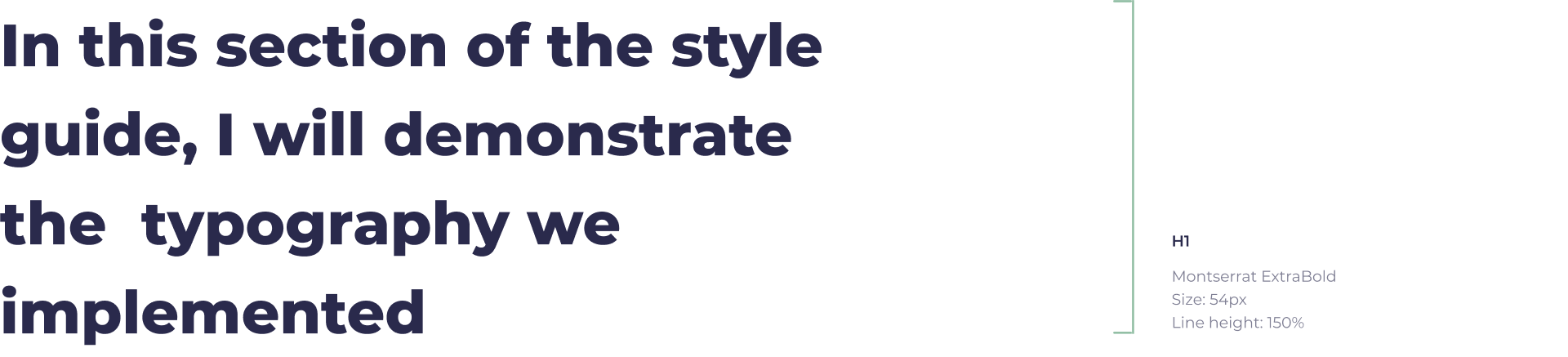
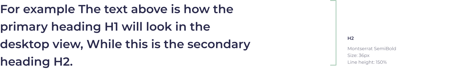
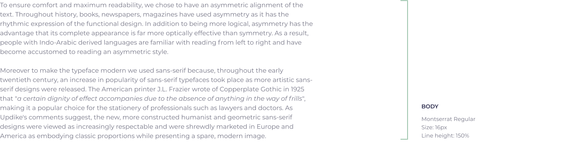
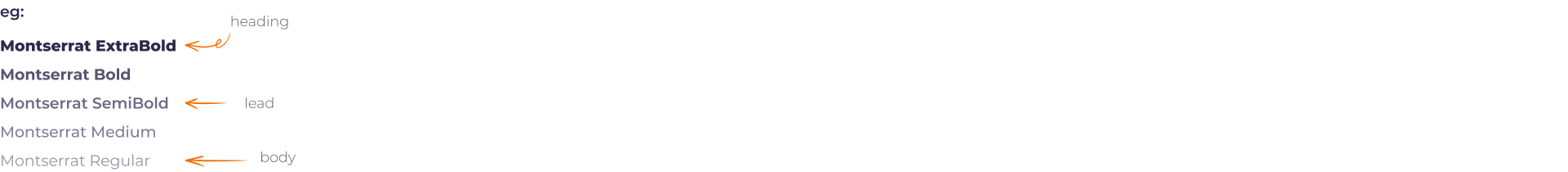
PROJECT DESCRIPTION
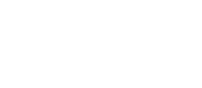
EngageWith is a comprehensive employee engagement platform. It helps companies recognise employee work or honour milestones by giving them points that you can redeem at your favourite e-commerce website. These recognitions can lift work culture, increase team bonding and result in increased productivity. My role as Senior Graphic Designer was to design a new logo, UI/UX for 20 landing pages and revamp the style guideline. The project started during the covid pandemic lockdown, where the market was changing fast. The challenge was to design a style guide with minimum product change and least development time. To do this task, I added harmonious colours and character illustrations to the existing design. This approach helped us integrate the vibrant values and team bonding experience we wanted. Moreover, due to the meticulous colour selection, not even a single product screen had to be changed.
OLD LOGO
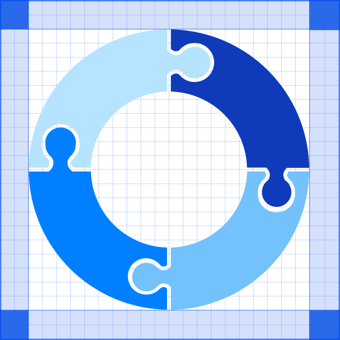
The top was the original logo designed for SpringEngage. As the product grew from an inter-team communication program to a comprehensive employee engagement platform, the logo became obsolete as it could not communicate the philosophy of the new enhancements. Even though the logo uses an abstracted form of user, it fails to deliver the core principles of a potent team. If one observes, all the users face the opposite as well as lack any meaningful full connection. Philosophically, traits as these can imply an ineffective team that lacks any genuine relationship between members.
COLOUR VARIATION
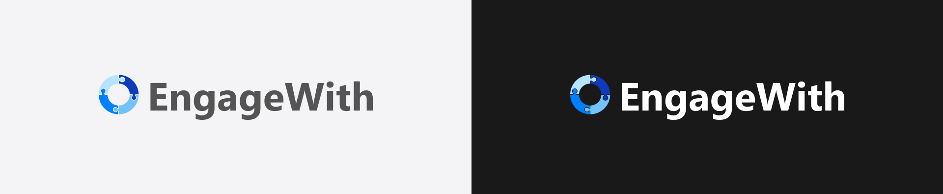
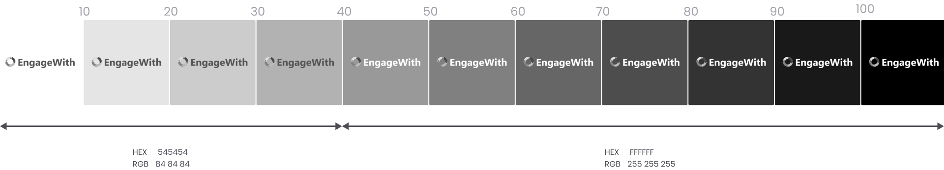
To improve the logo compatibility and provide a wider playing field for the designers to experiment with their ideas, we have two different versions of the Trivia logo. The “Trivia Dark” is suitable for designs where the background value is less than forty percent black whereas, “EW Light” is suitable for a dark background design. Having these two options are essential for the success of a logo. It provides two distinct contrast which allows a creative person to experiment with a wider range of colour pallet. To avoid assumptions while choosing a shade, switch to dot grain 20%* and use the below guide to check the correct colour contrast.
CONTRAST GUIDE


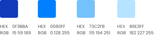
COLOUR PALETTE
An expertly crafted colour palette is a great starting point for a strong design language. All the Hues in this palette comes in multiple values starting from 0 to 100 black. This wide array of colours makes seamless creativity possible and helps the designers express the product in the best possible way to customers.
GREY FAMILY
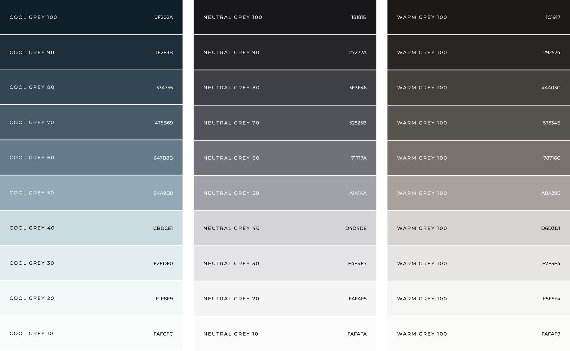
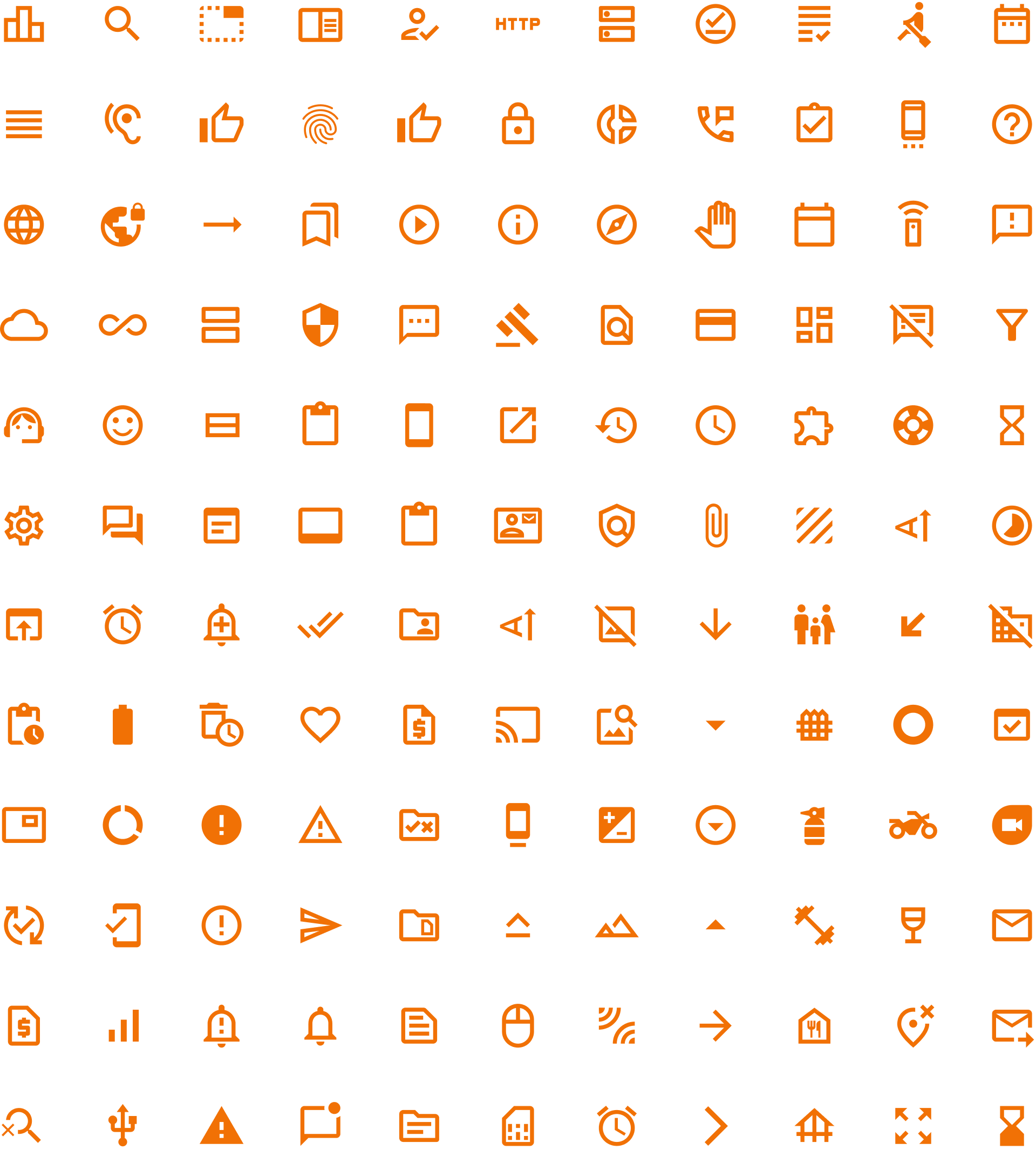
ILLUSTRATION PALETTE
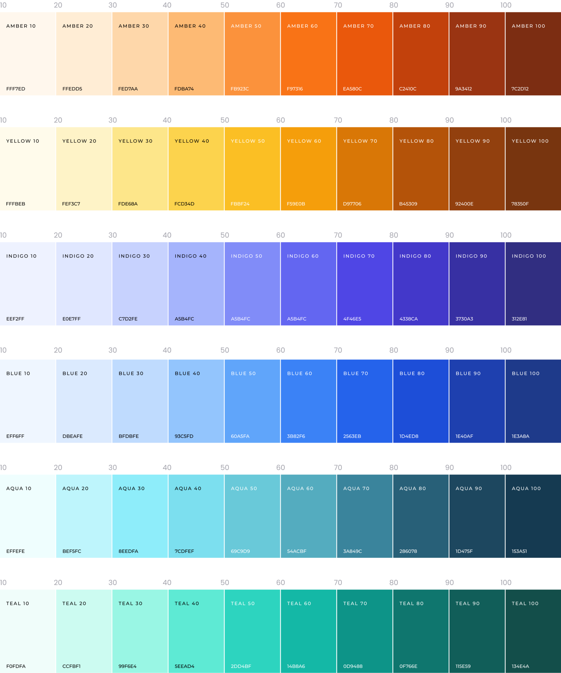
In the colour palette, we used three different families of greys “Cool grey”, “Neutral Grey”, and “Warm grey” for the background. The cool greys help symbolize a calm and stable environment, while the warm tones add energy and confidence. The neutral grey acts as a mediator that balances and creates harmony between the two shades. These families together establish a strong foundation that showcases the trust and solidity within a company. We have multiplied this emotional impact by using vivid hues for foreground elements. Colours like Amber and Yellow a indicate fun and positive attitude while the shades of Blue and Green help bring a calm sense to the design.
BREAKPOINTS
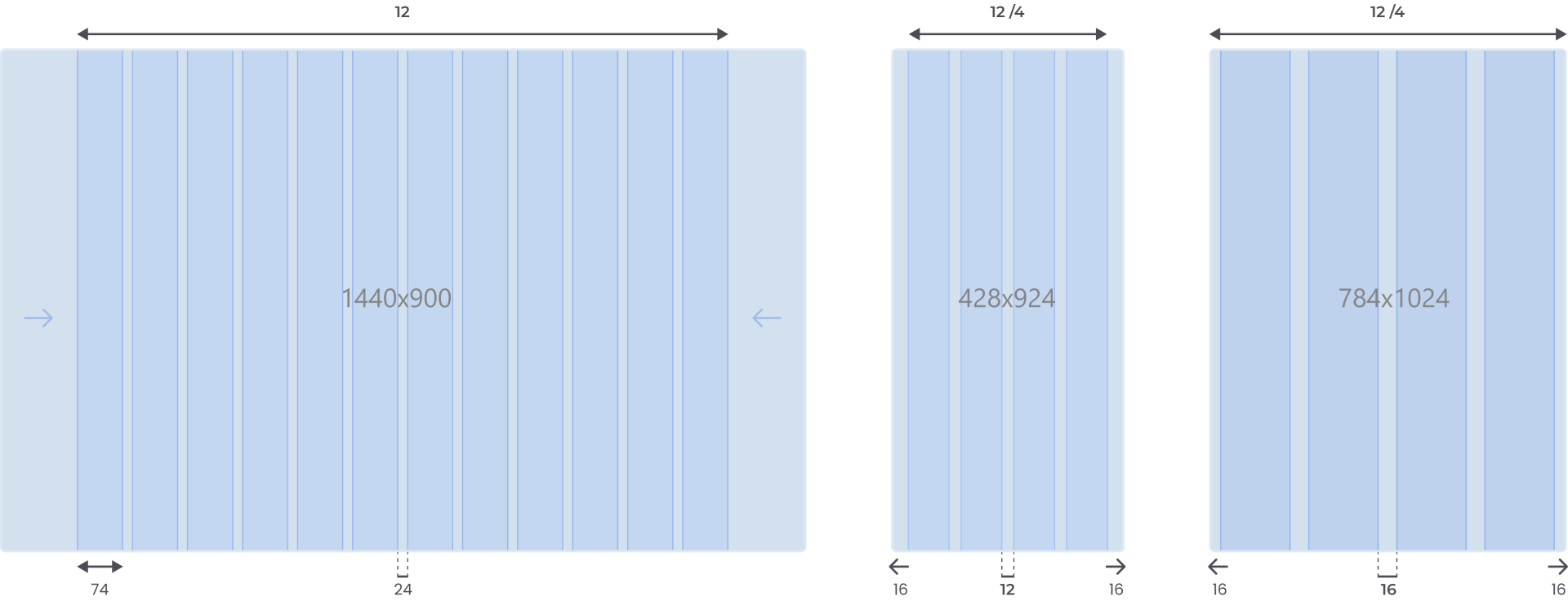
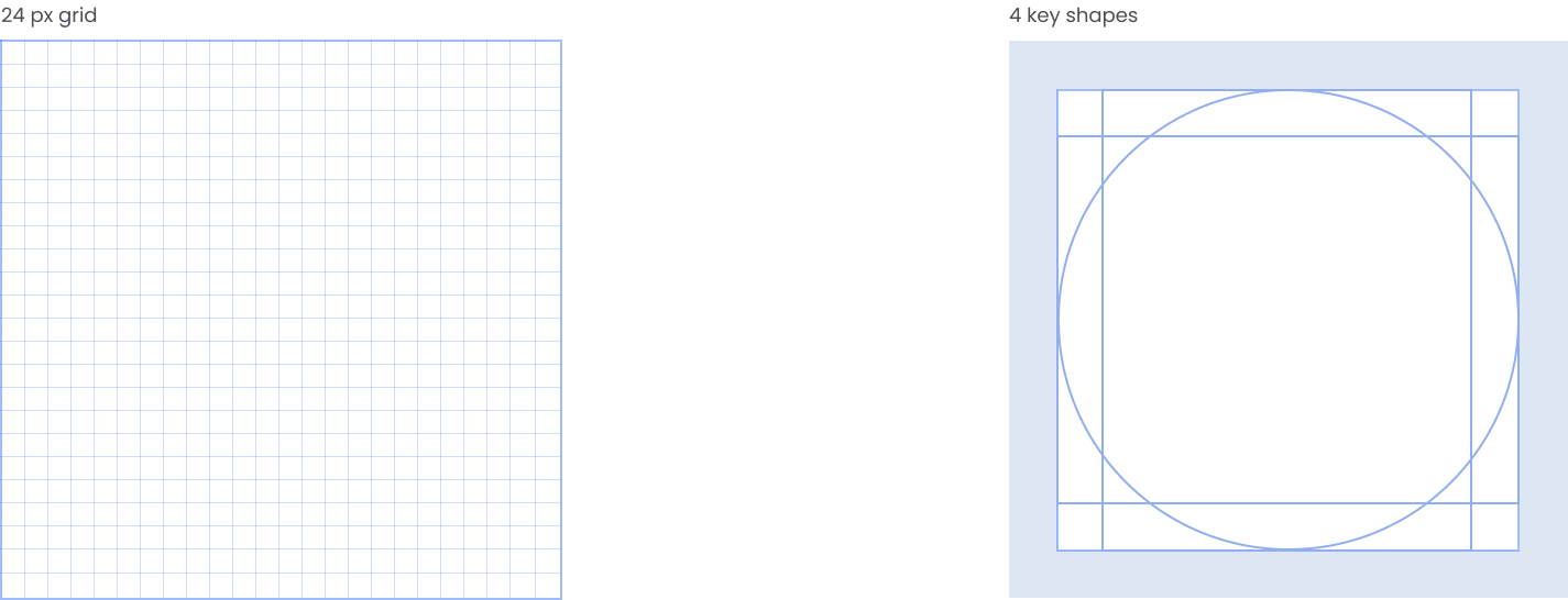
The above diagram demonstrates the spacing methods and layout grids that define structure, hierarchy, and rhythm in the landing page design. We have used 8px as the base unit because it makes scaling for a wide variety of devices easy and, most modern screen resolutions are divisible by eight. Additionally, to ensure uniformity across different devices, we have used column grids in ones and fourths. They are the most common layout used for web applications this assures an easy collaboration between designers.
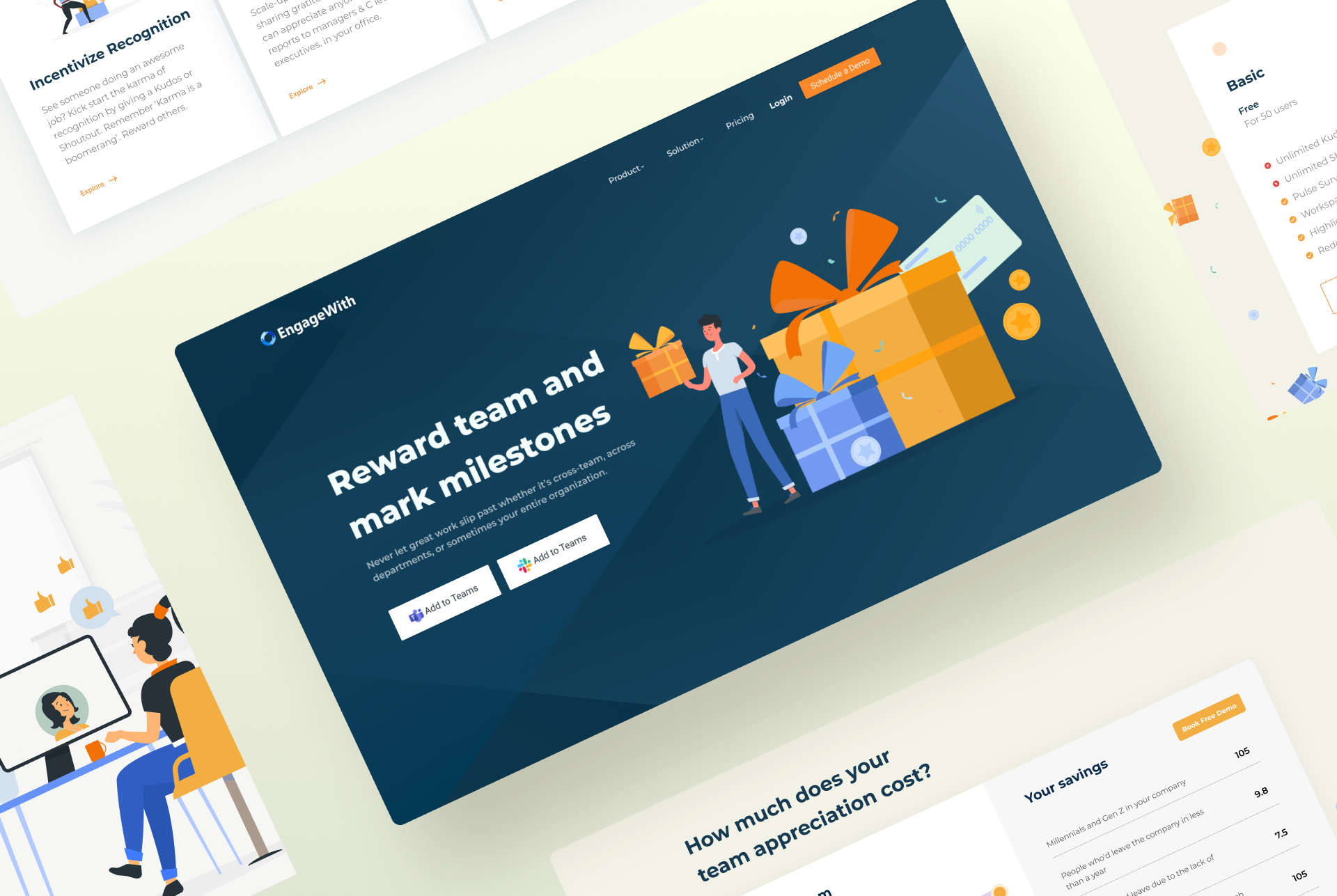
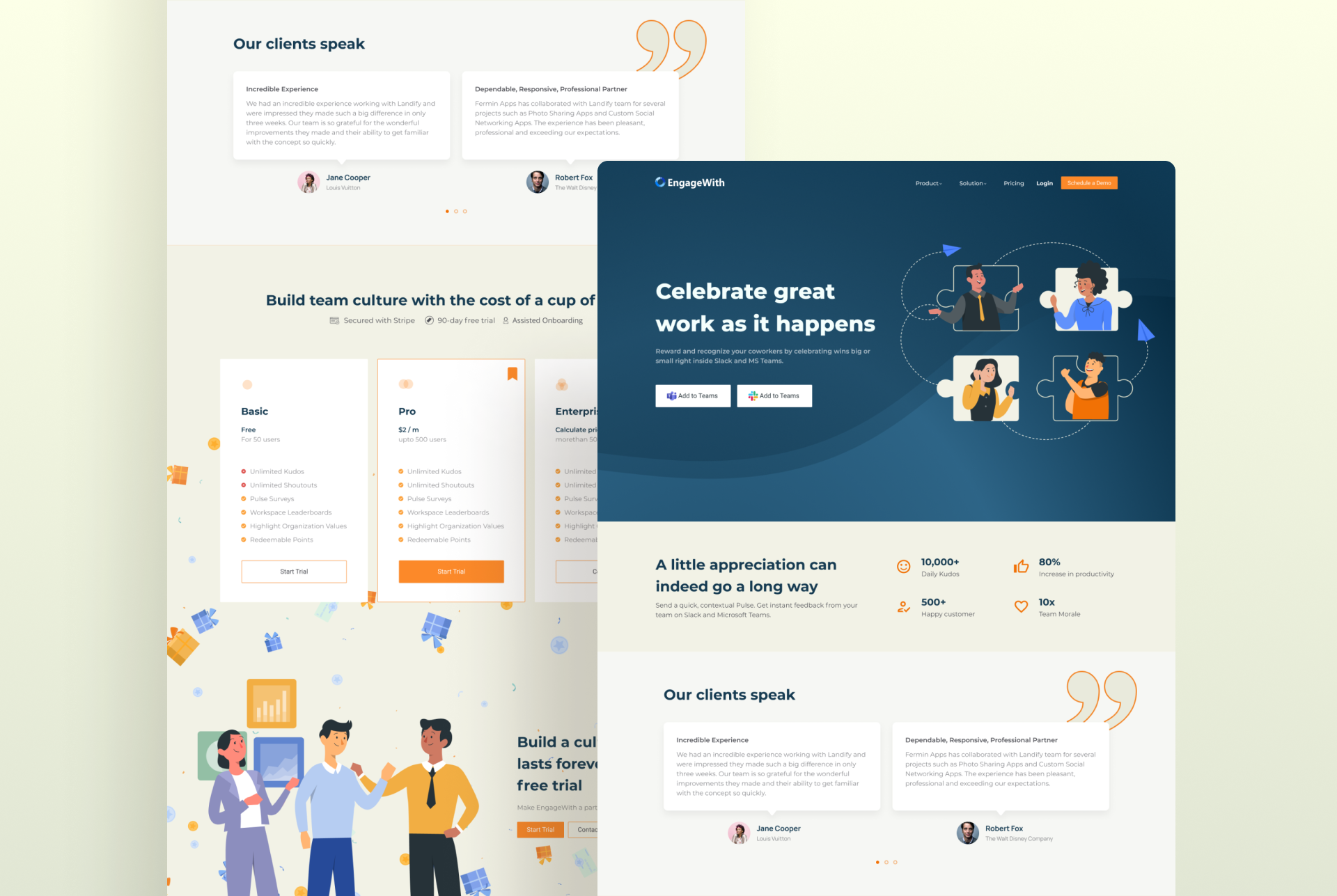
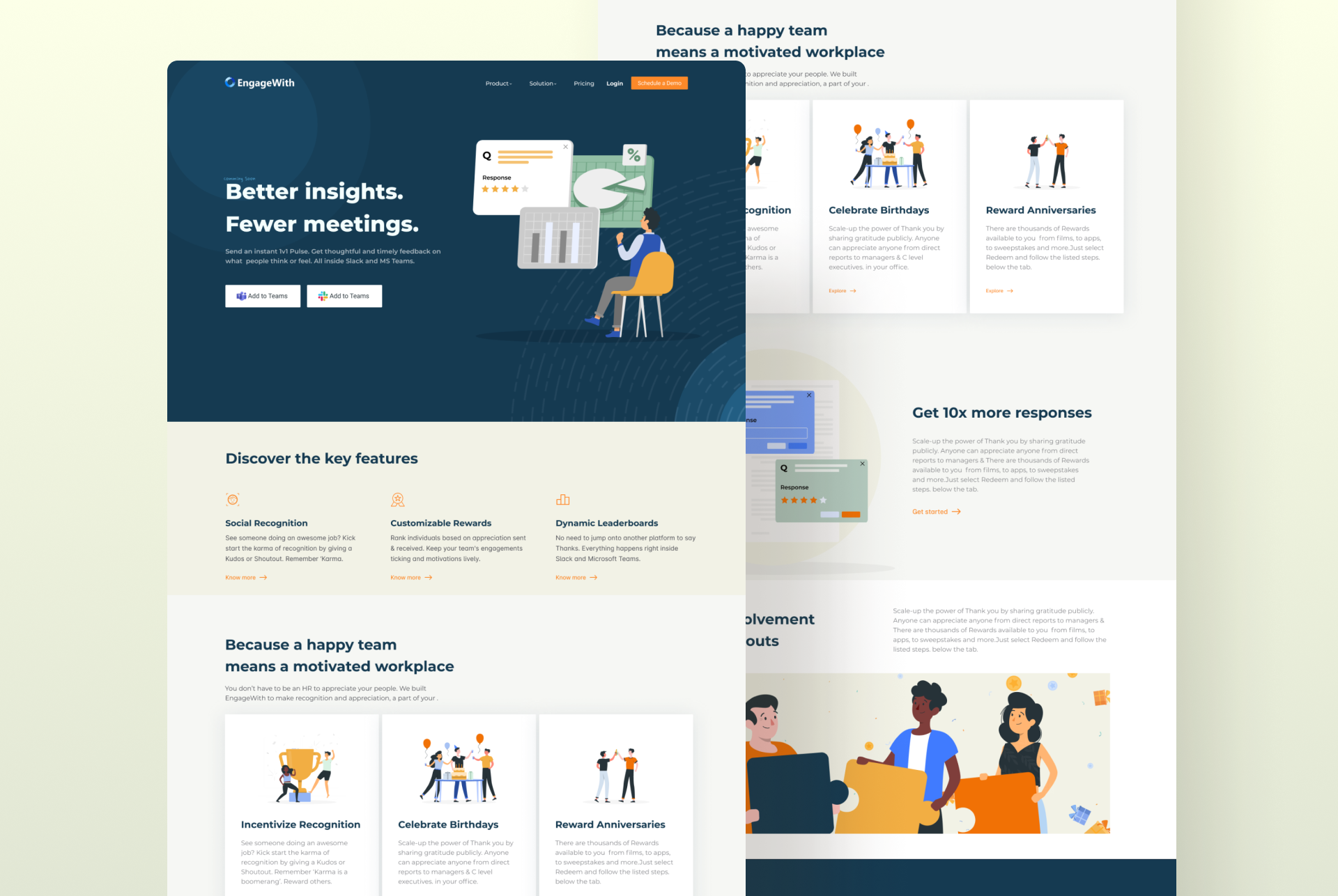
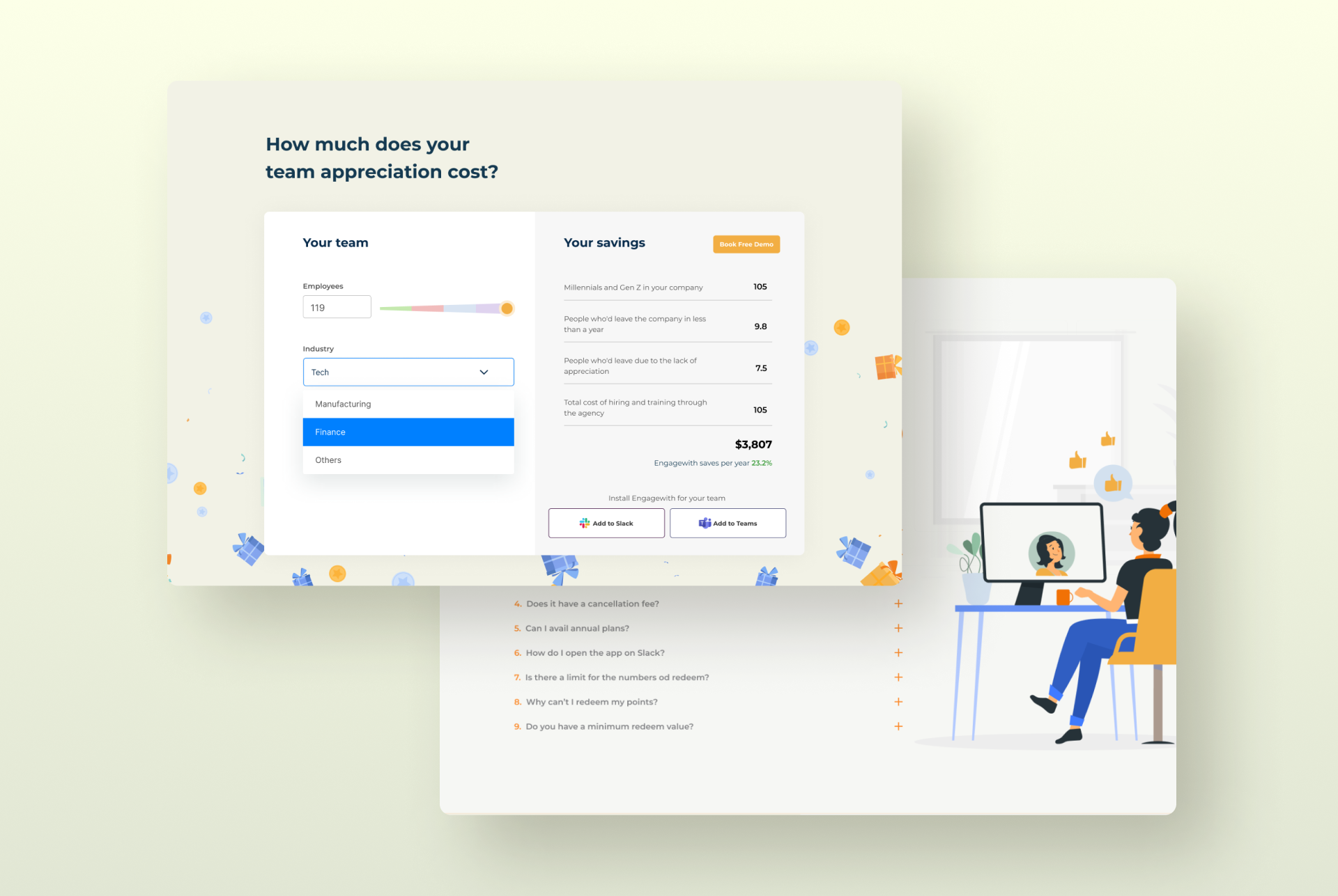
LANDING PAGE
A landing page is an integral part of any product’s success as it sets the first impression and acts as a bridge between a potential client and the marketing & sales team. To showcase the positive effects resulting from the reward and recognition features of the product, we used bright corporate style illustrations wherein the characters are joyfully interacting and celebrating camaraderie in their workspace. Additionally, By using confetti, gift boxes shapes and light hues in the background, we reestablish and elevate the concept further.