PROJECT DESCRIPTION
Trivia is a social application built for Slack and Microsoft teams. It helps organizations foster camaraderie, collaboration, and connections among teammates using games like quizzes, GIF Charades, Opinion polls. These games also help employees rejuvenate and uplift mental wellness, which in turn improves productivity in the company. My role was to design a logo and create a design language for marketing as well as the product, that fosters the positive values we aimed to bring with Trivia. To do so, I used vibrant gradients coupled with glassmorphism that brings a fresh look to the product and the landing page. Additionally, I chose a people-centric illustration library that targeted individual mental health. Later I translated the landing page designs into ad banners that are performing at 5x compared to the average industry standard CTRs.
LOGO IDENTITY
For the logo silhouette, I inverted the question mark symbol to represent the letter I in Trivia. This element helps us indicate the quiz and puzzle games to the users. Additionally, the upside-down question mark act as a brain teaser for our game Unpopular opinion as the user can either infer the shape as a letter I or a question mark. Down below are a few of the many concepts that I created while making this logo.
LOGO MARK
When concepting the logo I took into consideration the strong silhouette coupled with the vibrant gradients of blue, pink, and violet to help us showcase the zest and dynamic values we intend the product to bring among the employees whenever used by an organization. Moreover, the light values of colour help us entrust the positive mental wellbeing we are raising with the product.
LOGO COLOURS
COLOUR VARIATION
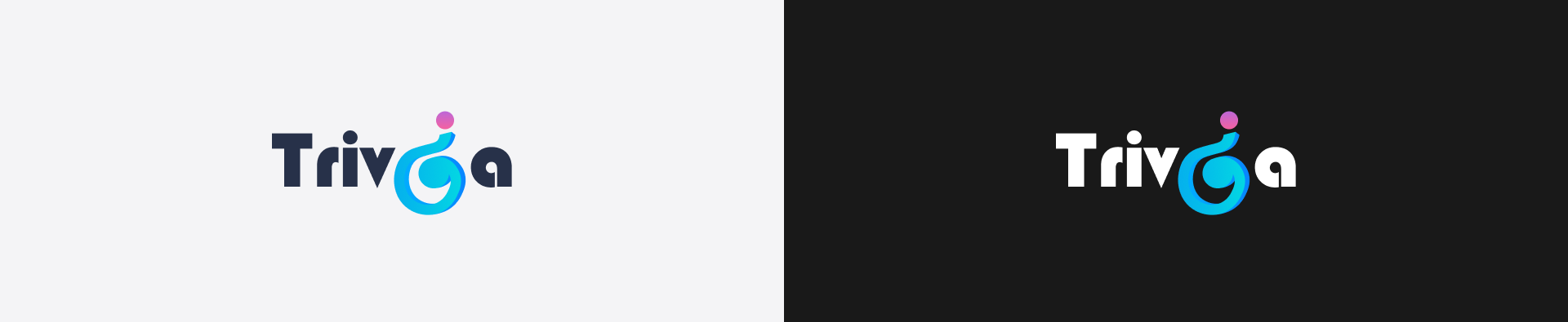
To improve the logo compatibility and provide a wider playing field for the designers to experiment with their ideas, we have two different versions of the Trivia logo. The “Trivia Dark” is suitable for designs where the background value is less than forty percent black whereas, “Trivia Light” is suitable for a dark background design. Having these two options are essential for the success of a logo. It provides two distinct contrast which allows a creative person to experiment with a wider range of colour pallet. To avoid assumptions while choosing a shade, switch to dot grain 20%* and use the below guide to check the correct colour contrast.
CONTRAST GUIDE
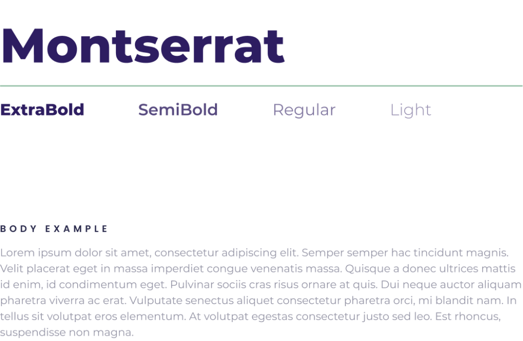
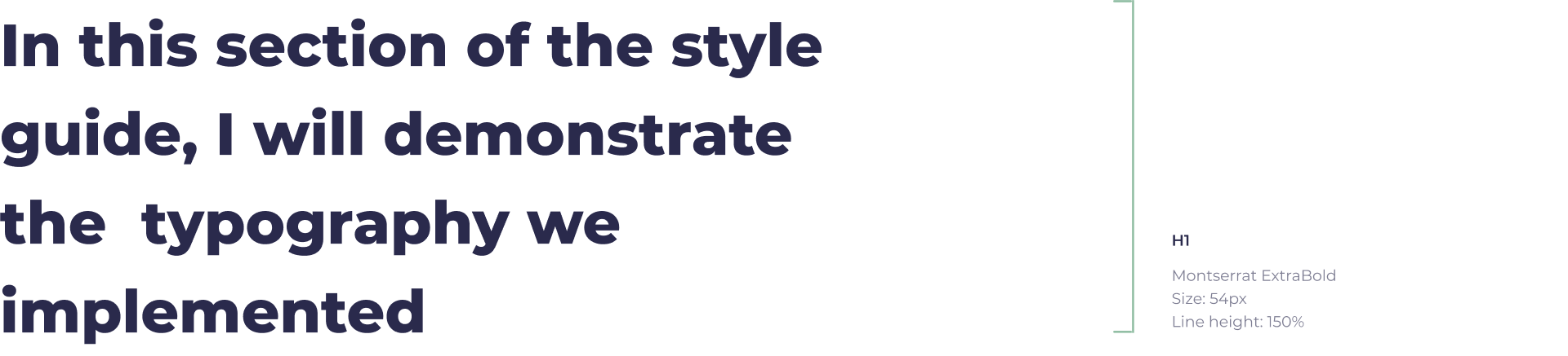
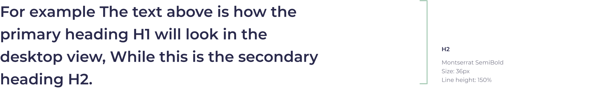
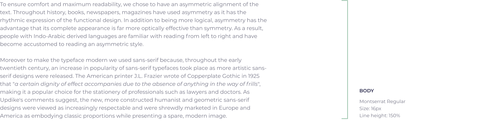
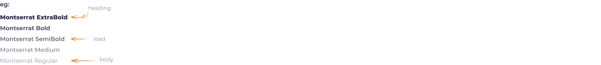
TYPOGRAPHY


PRODUCT ICONOGRAPHY
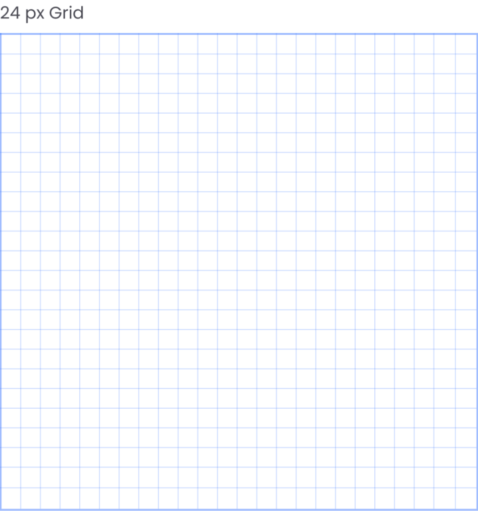
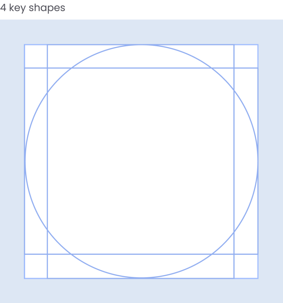
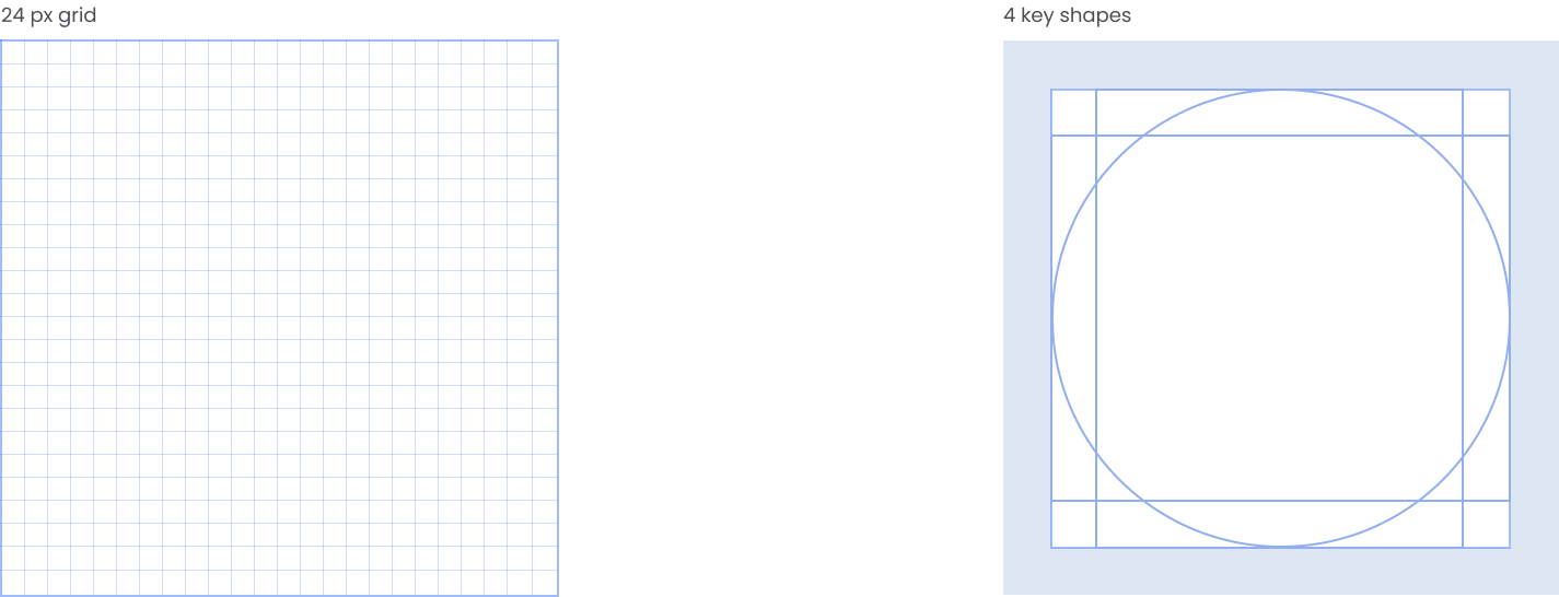
The app icons are an integral part of the product. We have used Material icons, using an open-source icon pack available under Apache license version 2.0 helped us save design time and development costs. All icons are organized in 24px frames with 2px padding from the frame.
TITLE ICONS
SECONDARY ICONS
COLOUR PALETTE
An expertly crafted colour palette helps us establish a well-defined design language that can summarise the entire product at a glance. For this, we incorporated a high chroma colour scheme to represent the delight and playfulness the product aims to bring to the work environment. All the Hues in this palette come in multiple values starting from 0 to 100 black. This spectrum of hues with a full range of values makes seamless creativity possible.
HUE AND VALUES
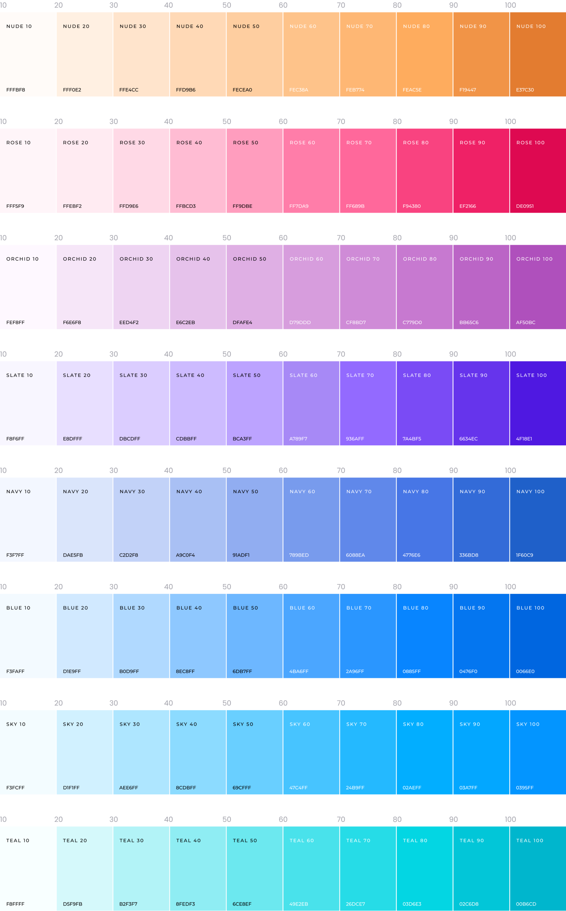
GRADIENT PALETTE
AD BANNERS
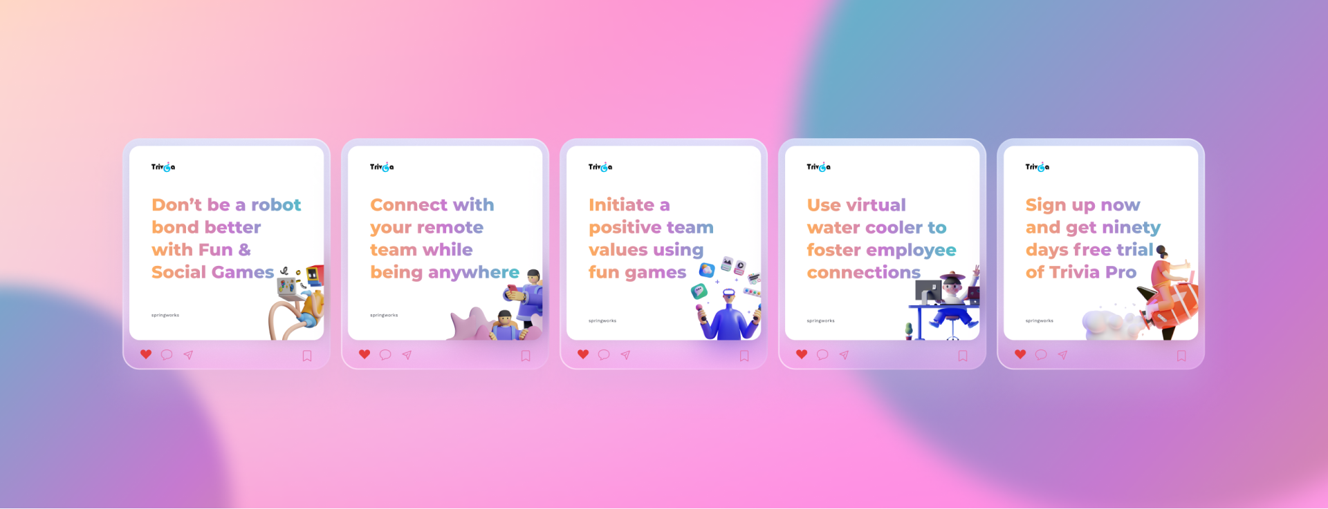
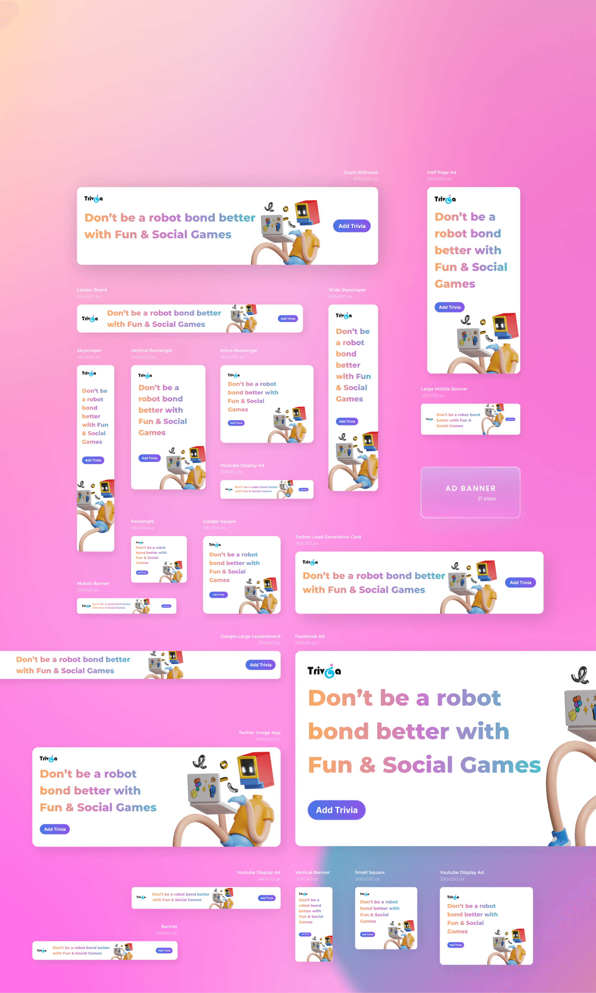
For Trivia, I created five variations of ads post for Instagram based on the main feature pages of the product. Moreover, I designed twenty-one different sizes of google ad mob banners that performed at 5X compared to the average industry standard CTRs.
INSTAGRAM ADS
GOOGLE AD BANNERS
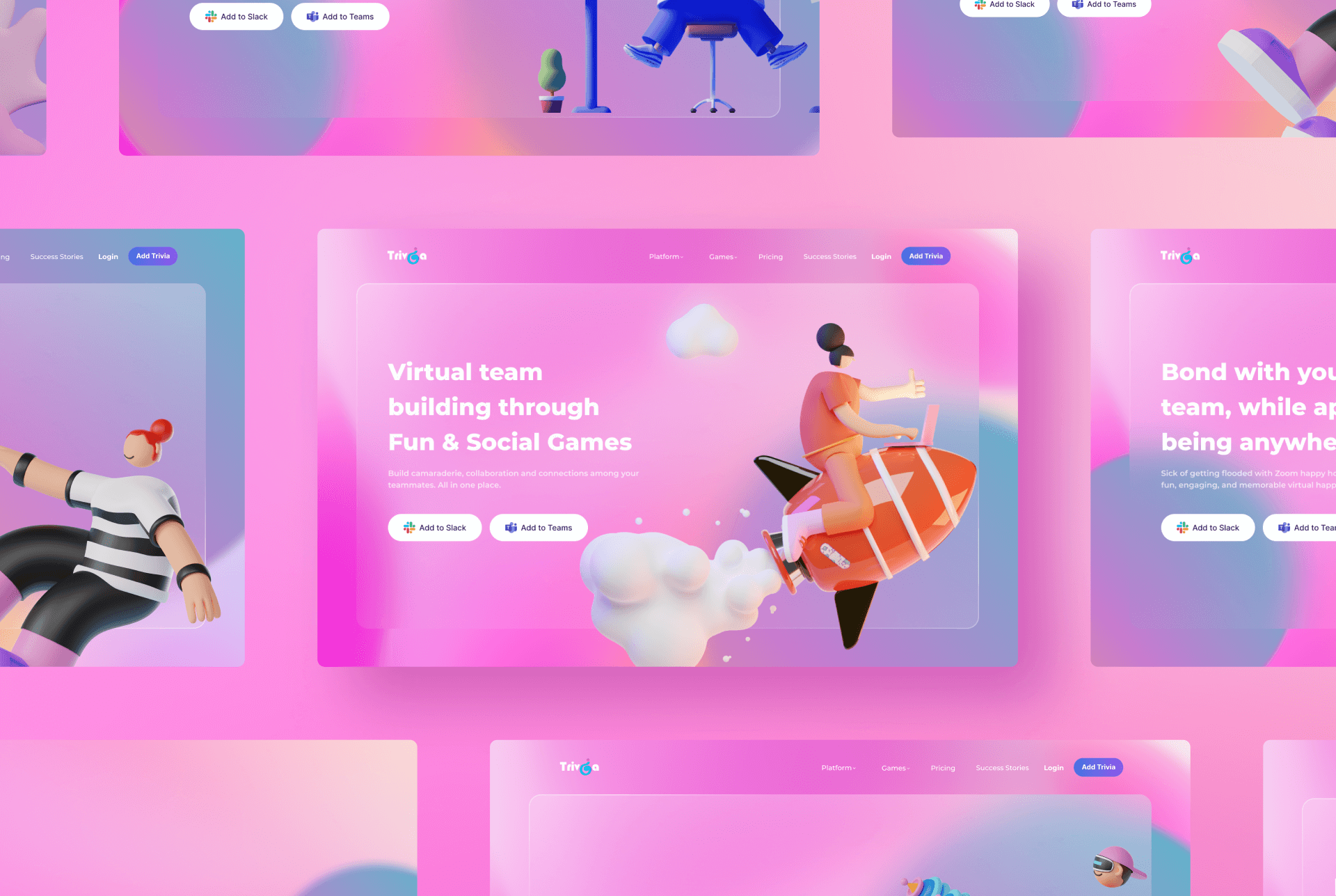
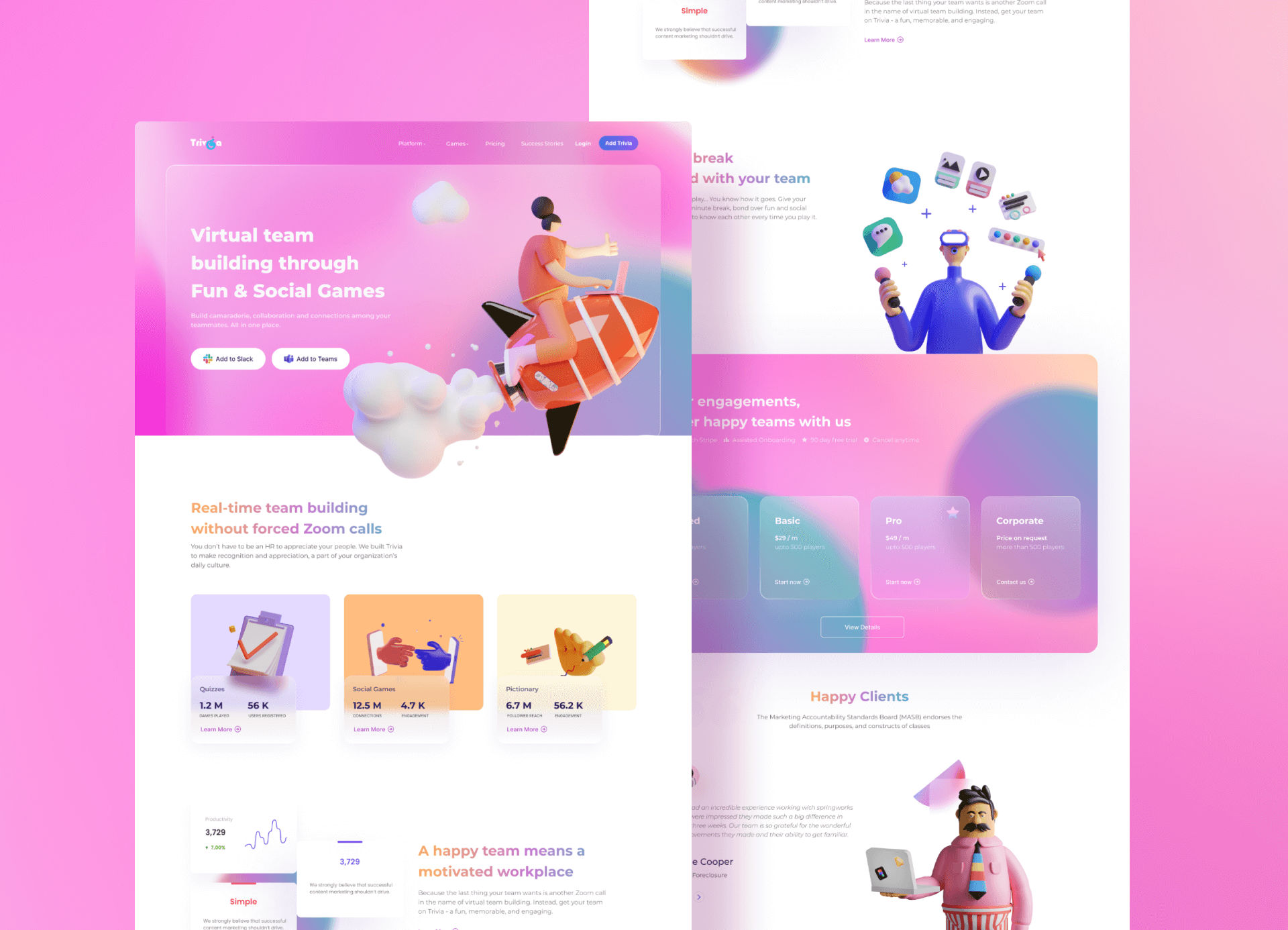
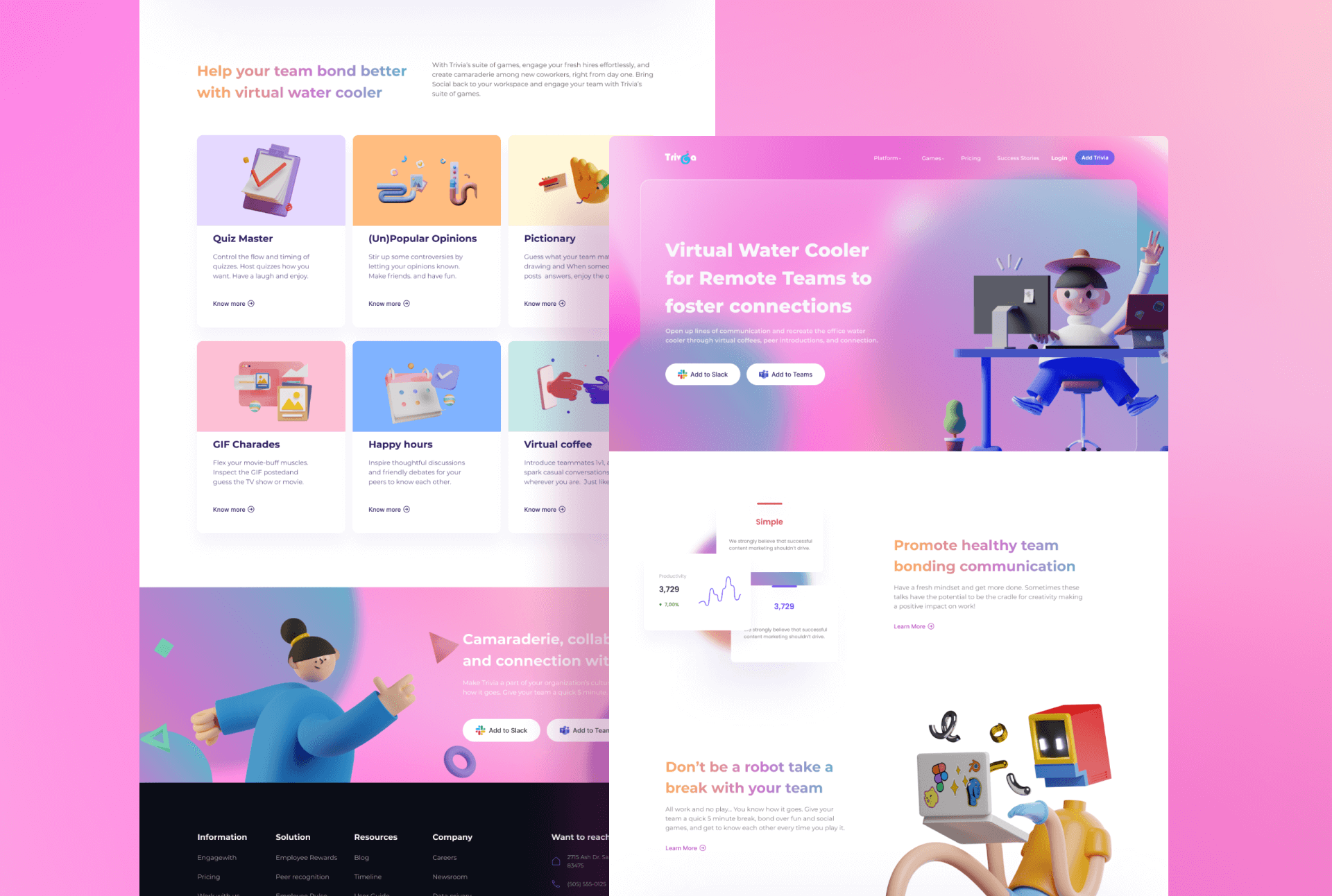
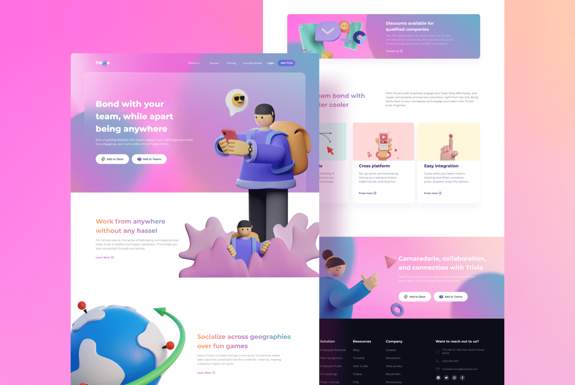
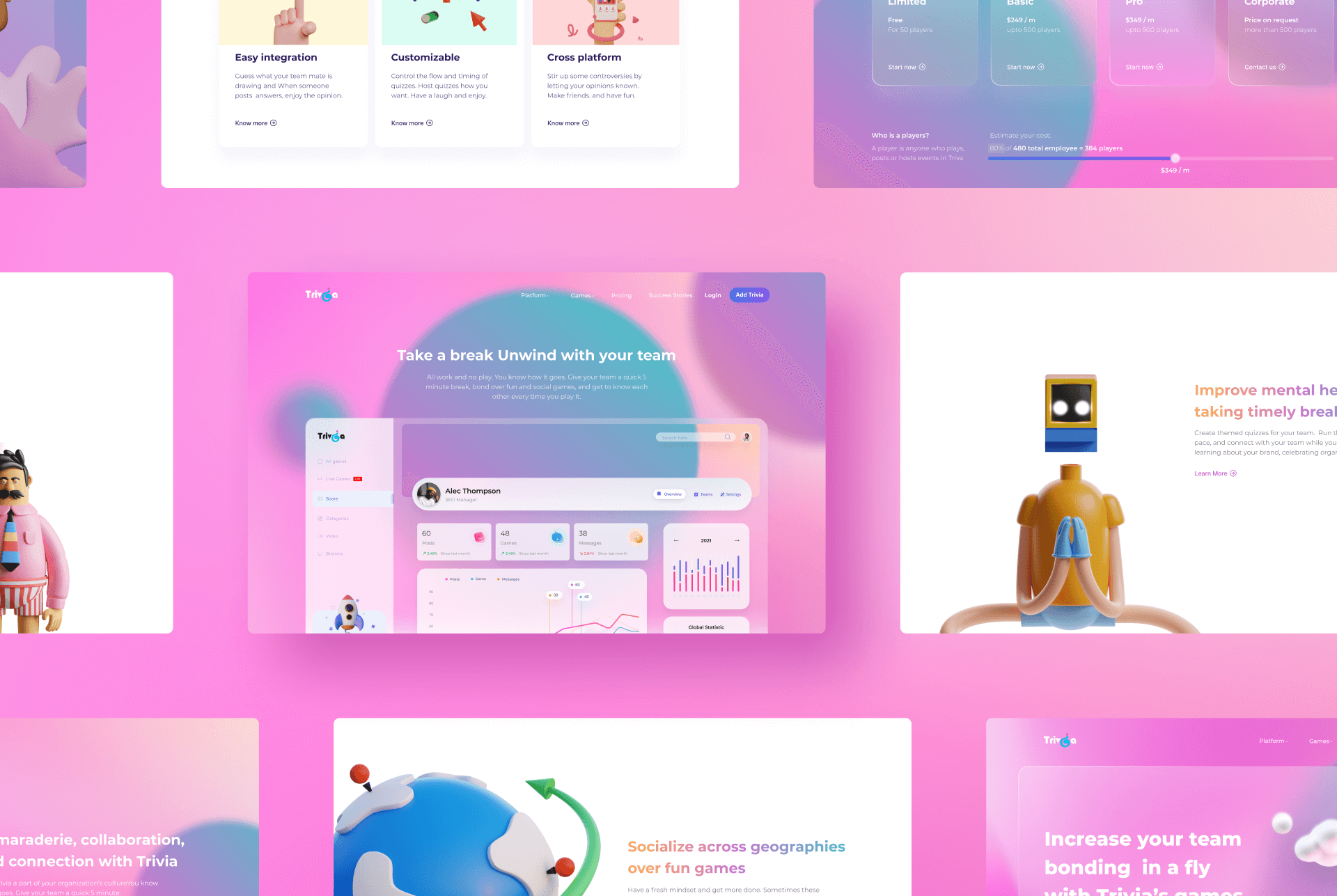
LANDING PAGE
Trivia is a product that essentially helps employees feel fresh and positive by scheduling regular breaks during working hours. Therefore for the landing page, I integrated the poppy colour scheme with 3d illustrations of individuals having fun in their break time. This user-centric illustration scheme helped us depict the positive impact of the product on an employee, as well as it also helped us target all the office culture types from work from home to hybrid to on-site.
Ved joined Springworks in January 2020 as our Graphic Designer. In other words, the person behind making all-things-Springworks beautiful. Since he joined, he’s helped us on the creative side on multiple projects, SpringVerify, SpringRecruit, EngageWith and Trivia. Over the last year working with Ved, he’s developed a proactive approach to understanding the technical front of products. With him, we’ve been able to add a touch of design to all of our products.
Kartik Mandaville, CEO Springworks
PROJECT DESCRIPTION
Trivia is a social application built for Slack and Microsoft teams. It helps organizations foster camaraderie, collaboration, and connections among teammates using games like quizzes, GIF Charades, Opinion polls. These games also help employees rejuvenate and uplift mental wellness, which in turn improves productivity in the company. My role was to design a logo and create a design language for marketing as well as the product, that fosters the positive values we aimed to bring with Trivia. To do so, I used vibrant gradients coupled with glassmorphism that brings a fresh look to the product and the landing page. Additionally, I chose a people-centric illustration library that targeted individual mental health. Later I translated the landing page designs into ad banners that are performing at 5x compared to the average industry standard CTRs.
LOGO IDENTITY
For the logo silhouette, I inverted the question mark symbol to represent the letter I in Trivia. This element helps us indicate the quiz and puzzle games to the users. Additionally, the upside-down question mark act as a brain teaser for our game Unpopular opinion as the user can either infer the shape as a letter I or a question mark. Down below are a few of the many concepts that I created while making this logo.
LOGO MARK
When concepting the logo I took into consideration the strong silhouette coupled with the vibrant gradients of blue, pink, and violet to help us showcase the zest and dynamic values we intend the product to bring among the employees whenever used by an organization. Moreover, the light values of colour help us entrust the positive mental wellbeing we are raising with the product.
LOGO COLOURS
COLOUR VARIATION
To improve the logo compatibility and provide a wider playing field for the designers to experiment with their ideas, we have two different versions of the Trivia logo. The “Trivia Dark” is suitable for designs where the background value is less than forty percent black whereas, “Trivia Light” is suitable for a dark background design. Having these two options are essential for the success of a logo. It provides two distinct contrast which allows a creative person to experiment with a wider range of colour pallet. To avoid assumptions while choosing a shade, switch to dot grain 20%* and use the below guide to check the correct colour contrast.
CONTRAST GUIDE
TYPOGRAPHY
PRODUCT ICONOGRAPHY
The app icons are an integral part of the product. We have used Material icons, using an open-source icon pack available under Apache license version 2.0 helped us save design time and development costs. All icons are organized in 24px frames with 2px padding from the frame.
FOUNDATION
TITLE ICONS
SECONDARY ICONS
COLOUR PALETTE
An expertly crafted colour palette helps us establish a well-defined design language that can summarise the entire product at a glance. For this, we incorporated a high chroma colour scheme to represent the delight and playfulness the product aims to bring to the work environment. All the Hues in this palette come in multiple values starting from 0 to 100 black. This spectrum of hues with a full range of values makes seamless creativity possible.
HUE AND VALUES
GRADIENT PALETTE
AD BANNERS
For Trivia, I created five variations of ads post for Instagram based on the main feature pages of the product. Moreover, I designed twenty-one different sizes of google ad mob banners that performed at 5X compared to the average industry standard CTRs.
INSTAGRAM ADS
GOOGLE AD BANNERS
LANDING PAGE
Trivia is a product that essentially helps employees feel fresh and positive by scheduling regular breaks during working hours. Therefore for the landing page, I integrated the poppy colour scheme with 3d illustrations of individuals having fun in their break time. This user-centric illustration scheme helped us depict the positive impact of the product on an employee, as well as it also helped us target all the office culture types from work from home to hybrid to on-site.
Ved joined Springworks in January 2020 as our Graphic Designer. In other words, the person behind making all-things-Springworks beautiful. Since he joined, he’s helped us on the creative side on multiple projects, SpringVerify, SpringRecruit, EngageWith and Trivia. Over the last year working with Ved, he’s developed a proactive approach to understanding the technical front of products. With him, we’ve been able to add a touch of design to all of our products.
Kartik Mandaville, CEO Springworks